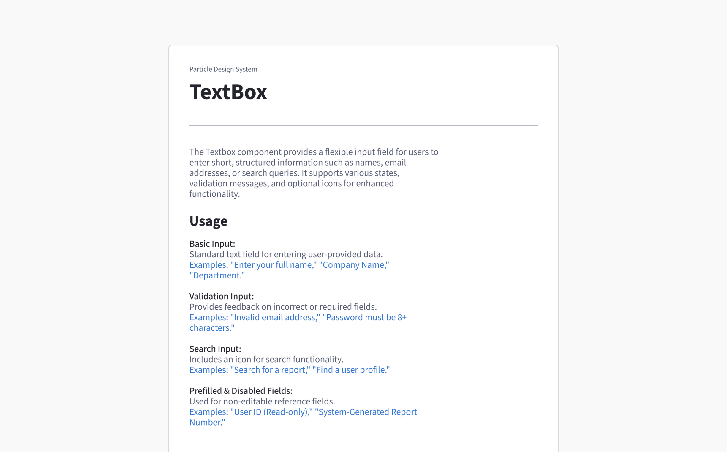
Particle Design System
At Vcheck, I led the creation of the Particle Design System—a scalable, component-driven framework built to bring consistency, clarity, and speed across our platform. It helped streamline collaboration between design and engineering, reduce UI debt, and accelerate product development.
Challenge
Before Particle, our teams dealt with inconsistent styling, unclear documentation, and repeated design work. Developers lacked a shared visual language, and designers often rebuilt components from scratch for each project—slowing everyone down.
Opportunity
This was our chance to build a single source of truth. By unifying brand, product, and development efforts under one system, we aimed to increase reusability, improve consistency, and simplify the design-to-dev handoff.

Research & Planning
I began by auditing the entire product UI—mapping patterns, redundancies, and inconsistencies. I ran interviews with engineers to identify pain points and missing states, and benchmarked systems from companies like IBM, Atlassian, and Microsoft to define a scalable, high-quality standard for Vcheck.
Approach
To ensure long-term adoption, I prioritized modularity, clarity, and performance. I structured Particle into four key layers:
Foundations: Color, typography, spacing, elevation, radius, grid.
Components: Buttons, inputs, modals, tables, dropdowns, tabs, etc.
Patterns: Status indicators, form flows, filter panels, data views.
Documentation: Usage rules, do’s & don’ts, accessibility, naming conventions.
Particle wasn’t just a design system—it became the backbone of how Vcheck designs and ships products with confidence.
Final System
Particle includes over 60 components with 200+ variants, supporting light/dark mode, responsive behavior, and WCAG AA accessibility. Every component is tokenized, documented, and mapped to our engineering framework—for seamless implementation.
You can view the Figma file to explore the full system, including specs, usage guidance, and real-world examples.


Design Tokens Built for Growth
Tokens define color, typography, spacing, and radius. They sync with Figma variables and development tokens for perfect alignment across design and code.
Smart Theming
Define a color once—it cascades automatically through buttons, charts, alerts, and modals across light and dark modes.
Atomic Spacing
A 4px scale keeps spacing consistent, reducing decision fatigue and helping designers build faster.

Over 60 Reusable Components, 200+ Variants
Each component includes all interaction states—hover, active, error, disabled—so developers don’t guess and designers don’t duplicate. Rigid enough to enforce standards, flexible enough to adapt to edge cases.
Flexible + Rigid
Button systems, modals, tabs, and inputs come with smart constraints while still allowing variations for edge cases.
Built for Collaboration
Every component is paired with dev specs, naming conventions, and behavior notes, making translation into development near frictionless.
Usage Guidelines. Naming Standards. Do’s & Don’ts
Every component is documented with practical examples and clear guidance—designed not just for designers, but also for engineers, QA, and PMs.
Pattern Guidance
Form flows, filters, data views, and alerts are documented with real examples and business logic—making the system practical for any use case.
Accessibility Built In
ARIA roles, keyboard navigation, and color contrast are integrated by default and Figma-tested.

Designed with Use Cases, Not Just Screens
Particle wasn’t made in isolation. It was pressure-tested across projects like background screening, report generation, subject forms, and new order flows—adapting to different product needs while remaining consistent.
Used Across 3 Vcheck Teams
The system supports internal admin tools, customer-facing portals, and analyst dashboards—all through one shared foundation.
Results
UI design time dropped by ~40% for new features.
Engineers now ship 2x faster with ready-to-go specs.
Design QA requests dropped significantly due to clear documentation.
What I Learned
Systems scale design. A good system is invisible—it empowers creativity without getting in the way.
Adoption starts with empathy. Including devs early made the system practical, not idealistic.
Documentation is a feature. Without guidance, even the best components fall short.
Next Project
Transformed the news platform with a clean, mobile-first design—boosting engagement and simplifying navigation across content types.
Let’s build something meaningful!
Currently open for freelance and part-time projects.