Portal Revamp
At Vcheck, I led the redesign of our customer portal, transforming it from a fragmented, email-driven system into a streamlined, self-serve experience. The new portal made it easier for clients to create orders, track projects, and access reports, helping them work more efficiently and with greater confidence.
Challenge
The original portal was fragmented and difficult to use. Clients often relied on email for new orders, struggled with unclear navigation, and found it hard to locate past reports or track project status. This led to inefficiencies, confusion, and an over dependence on manual support.
Opportunity
This was a chance to reimagine the portal as a true product experience. By streamlining the order flow, restructuring navigation, and creating a consistent design system, we could shift clients toward self-service and make the portal the trusted hub for all their risk intelligence needs.
Research
We conducted interviews with clients, investigators, and sales teams to uncover pain points, then mapped user journeys to visualize friction. Portal analytics and behavioral data from tools like Amplitude revealed high abandonment rates, long completion times, and heavy reliance on email.
72% of new orders were still initiated via email instead of the portal.
Clients spent an average of 5–7 minutes locating a single report.
Bounce rates from the portal homepage were at 38%.
Inconsistent design and outdated visuals led to confusion and poor adoption.
Our goal was to turn the portal from scattered tools into one seamless workspace.
Approach
We approached the revamp by focusing on simplifying workflows, creating consistency, and building a scalable foundation for future growth.
Streamlined workflows to make order creation and report access intuitive.
Unified the experience with a consistent design language.
Established a scalable foundation to support future features and growth.
Improved information architecture for clearer, more predictable navigation.
We brought these methods to life through close collaboration with product, engineering, and stakeholders. This process ensured the redesigned portal was intuitive for users and adaptable for future growth.
Final Design
The redesigned portal delivered a modern, client-first experience with a clear dashboard, guided order flows, and a unified report library. Improved navigation, responsive layouts, and a refreshed visual design made the portal easier to use, more trustworthy, and better equipped to support future growth.
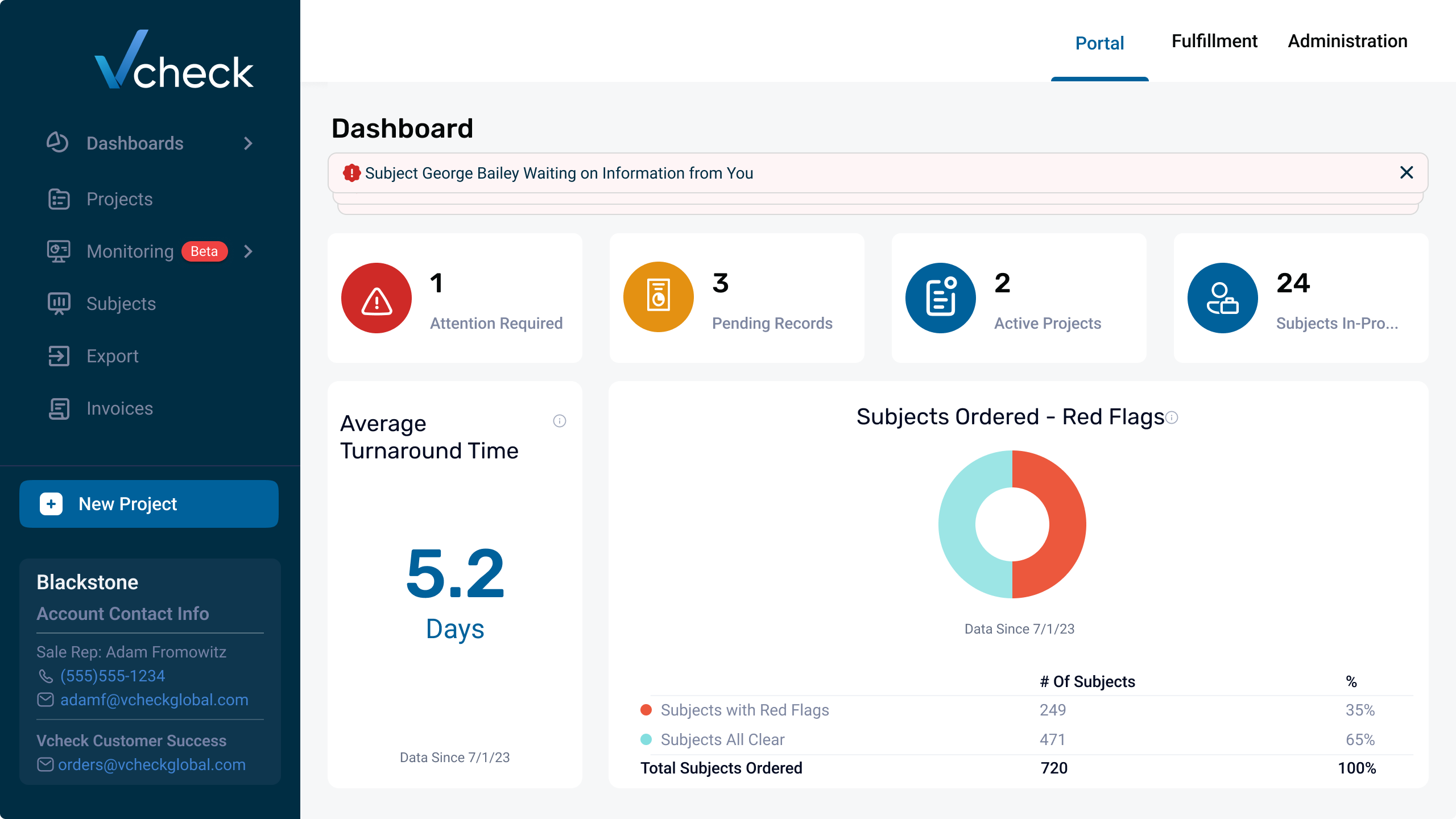
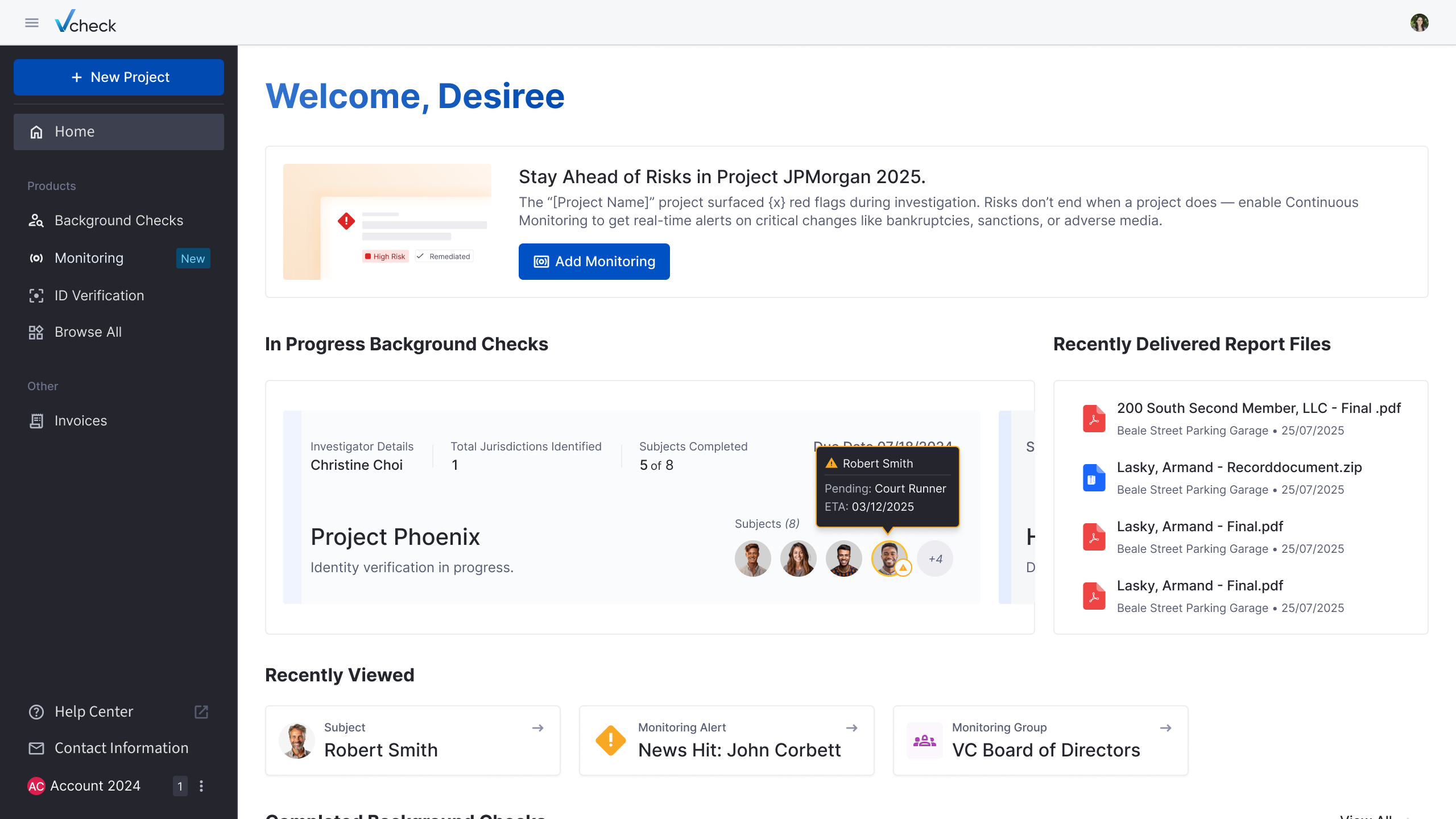
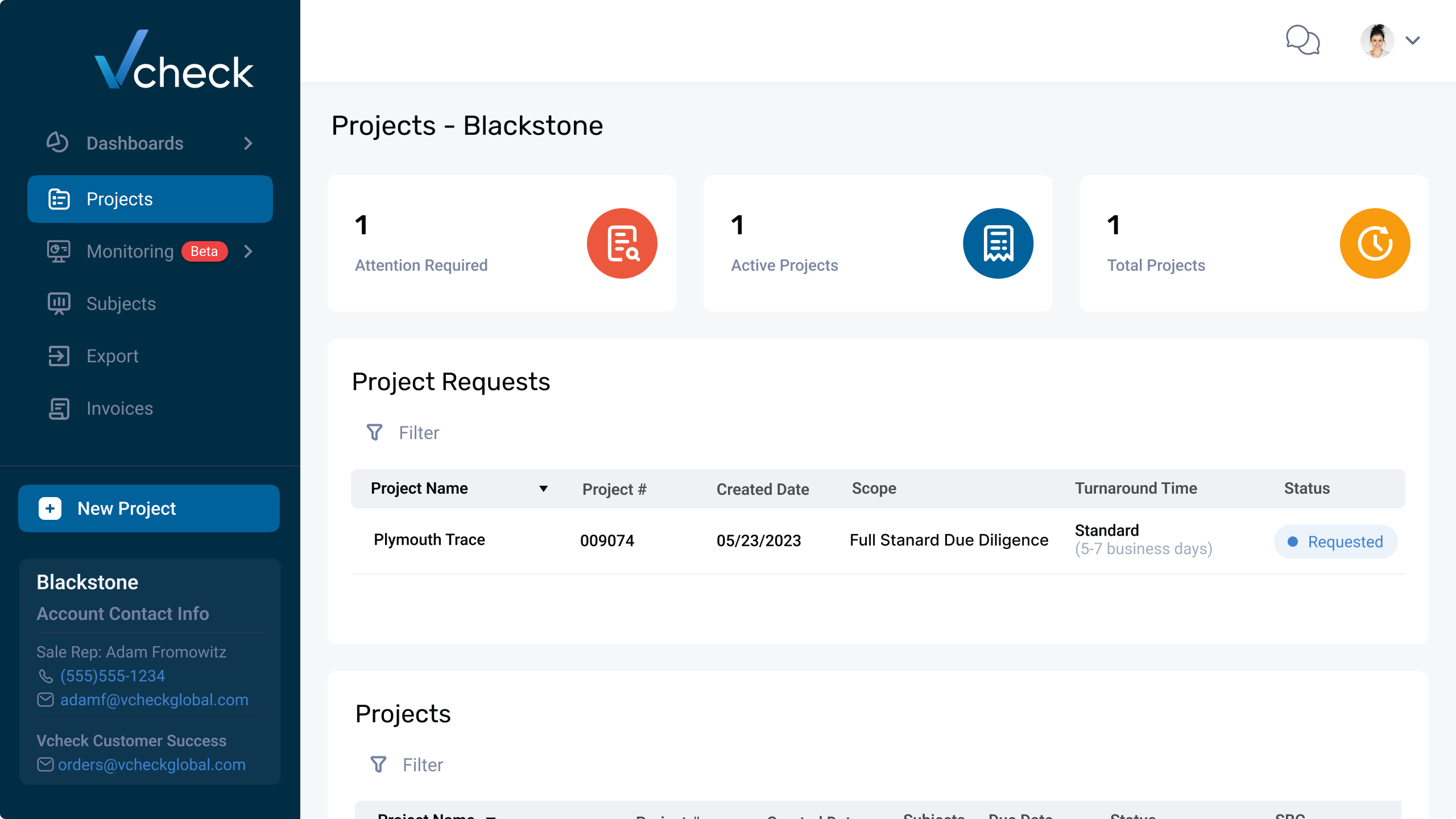
The dashboard was redesigned into a clear, action-focused workspace. Key information like active projects, monitoring alerts, and recent reports is now surfaced upfront, helping clients quickly see priorities and act with confidence.
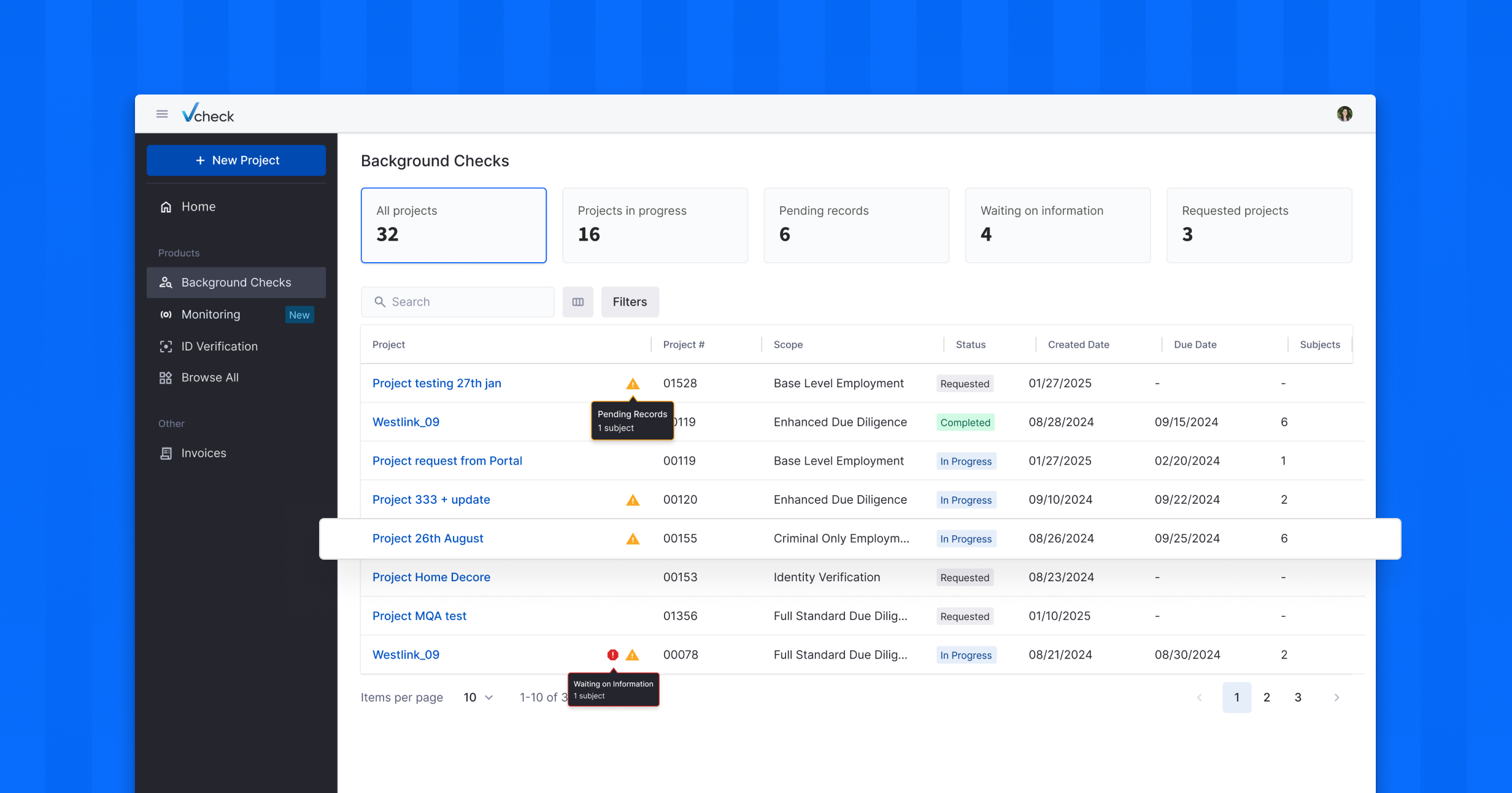
The project listing was redesigned to remove clutter, strengthen hierarchy, and bring consistency across views. This made it easier for clients to scan details, track progress, and take action, resulting in greater efficiency and a more reliable experience.


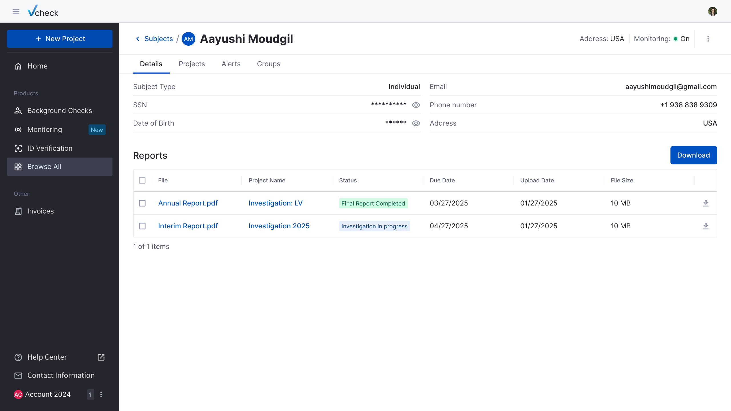
The old subject view was basic and difficult to navigate, with limited context and scattered details. In the new design, we introduced a structured layout that combines reports, subject details, and project activity into one clear view. This makes it easier for clients to track progress, collaborate with participants, and manage subjects with confidence.
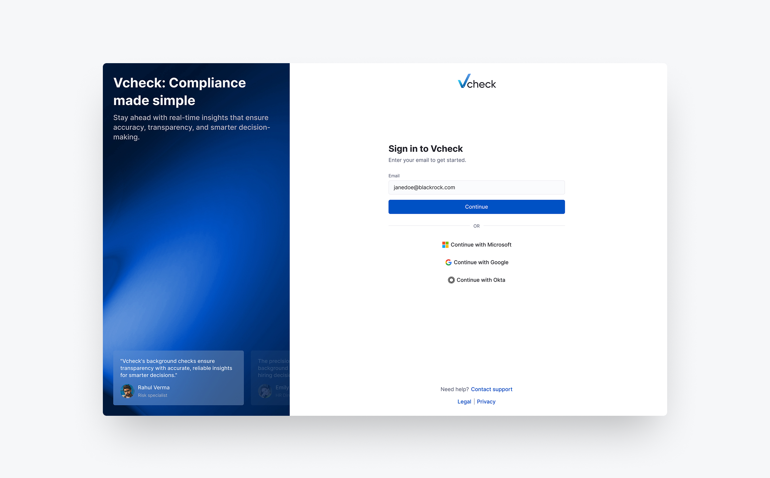
Sign In
As part of the portal revamp, we refined the sign-in flow to create a secure and welcoming entry point into the platform. The design emphasized clarity, accessibility, and trust, with thoughtful error handling and intuitive guidance.

Order Flow
We redesigned the order flow into a guided, step-by-step experience. The new structure ensured clarity, reduced errors, and gave clients confidence that their requests were complete and ready to move forward.
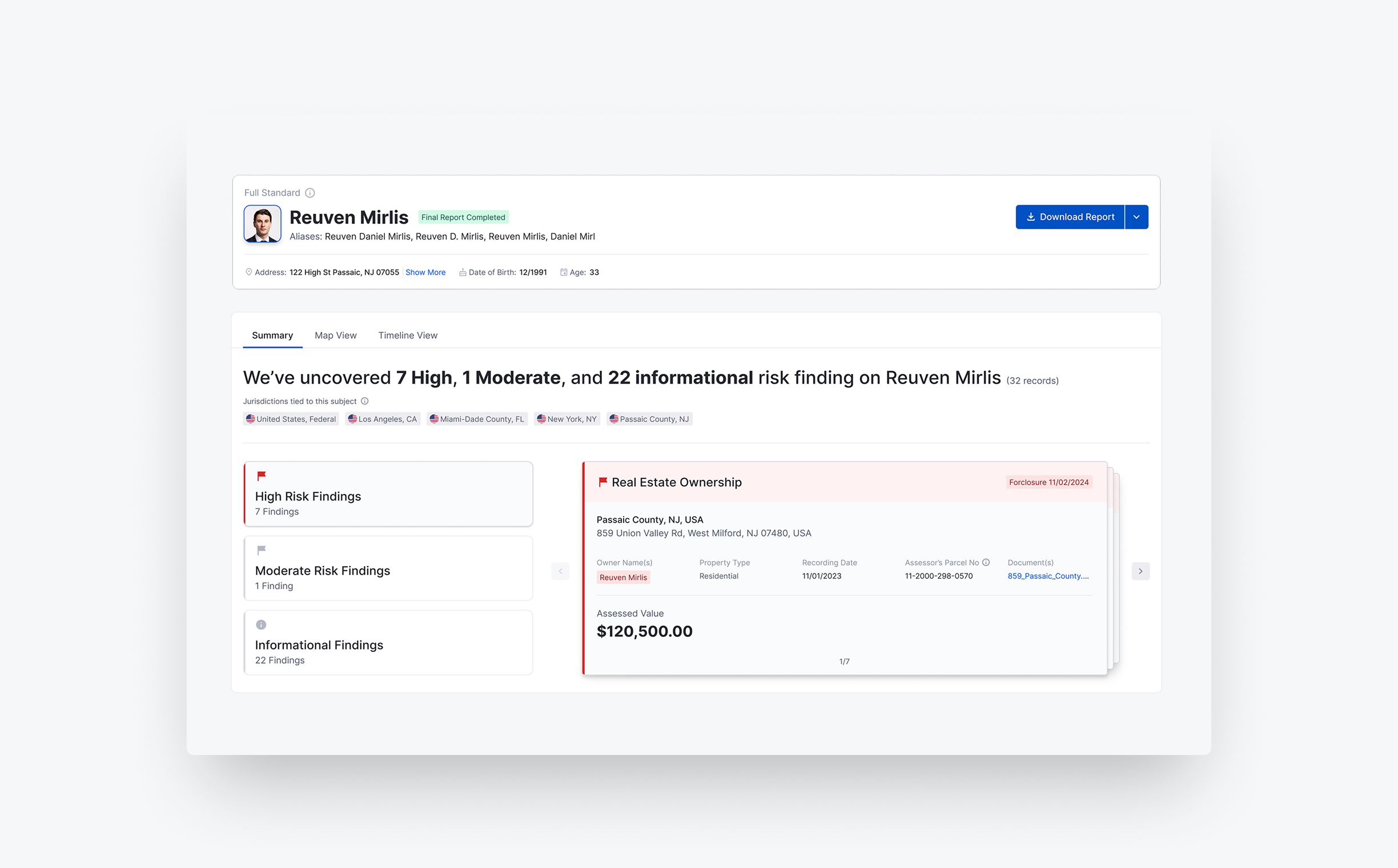
Interactive Reports
We introduced interactive reports with dynamic filters, search, and collapsible sections. This transformed reports into a more engaging experience, making insights easier to navigate, faster to interpret, and more actionable for clients.
Results
65% increase in portal-initiated orders within three months of launch, reducing email dependency significantly.
12% uplift in client renewals, with stakeholders citing the portal as a key differentiator.
Improved overall client confidence and satisfaction, with usability rated higher in post-launch feedback sessions.
What I Learned
Research drives clarity. Combining interviews, analytics, and journey mapping revealed hidden inefficiencies that shaped the redesign with confidence.
Consistency builds trust. A unified design language across navigation, flows, and visuals not only simplified the portal but also strengthened client confidence in the product.
Small changes compound. Improvements like clearer navigation, guided order flows, and structured project listings collectively created a more intuitive and powerful client experience.
Next Project
Reimagined static PDFs into interactive, insight-first experiences that simplify complex investigations and help clients focus on what matters.
Let’s build something meaningful!
Currently open for freelance and part-time projects.